Brave Spark branding
Stickers, illustrations and branding work for Brave Spark Creative Studio.
Branding
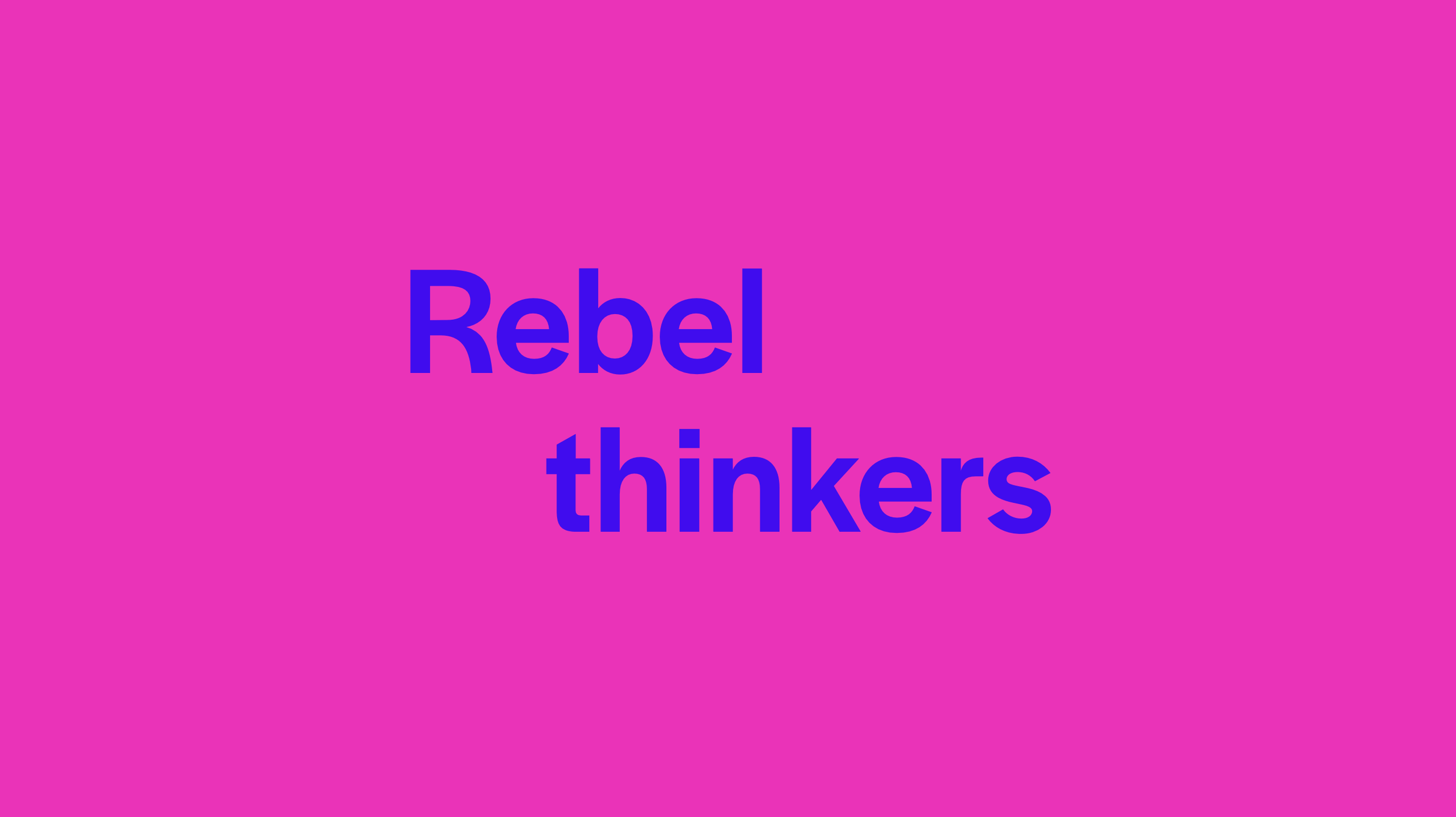
As part of my interview for Brave Spark, I designed a brand refresh, including updated colors, typographic treatment and a motion system that linked to their logo. I started by examining their current branding by looking at their logo (as I knew I wanted to keep this the same). I found one way of viewing their logo, was a shifted square. I liked the idea of ‘shifting’ as Brave Spark often shifted Brave ideas which went onto Spark a shift in mindsets. This, as well as the ‘L’ shape of their logo, inspired a new system which still felt Brave Spark.


Stickers
A big part of Brave Spark’s branding is stickers. When designing them it was important to be brave (which I achieved via bright and bold colours). I designed over 50 stickers for Brave Spark including emoji-like designs (e.g. hand gestures), inside jokes (no elephants) as well as fun nods to the brand (logos and sparks)