50 30
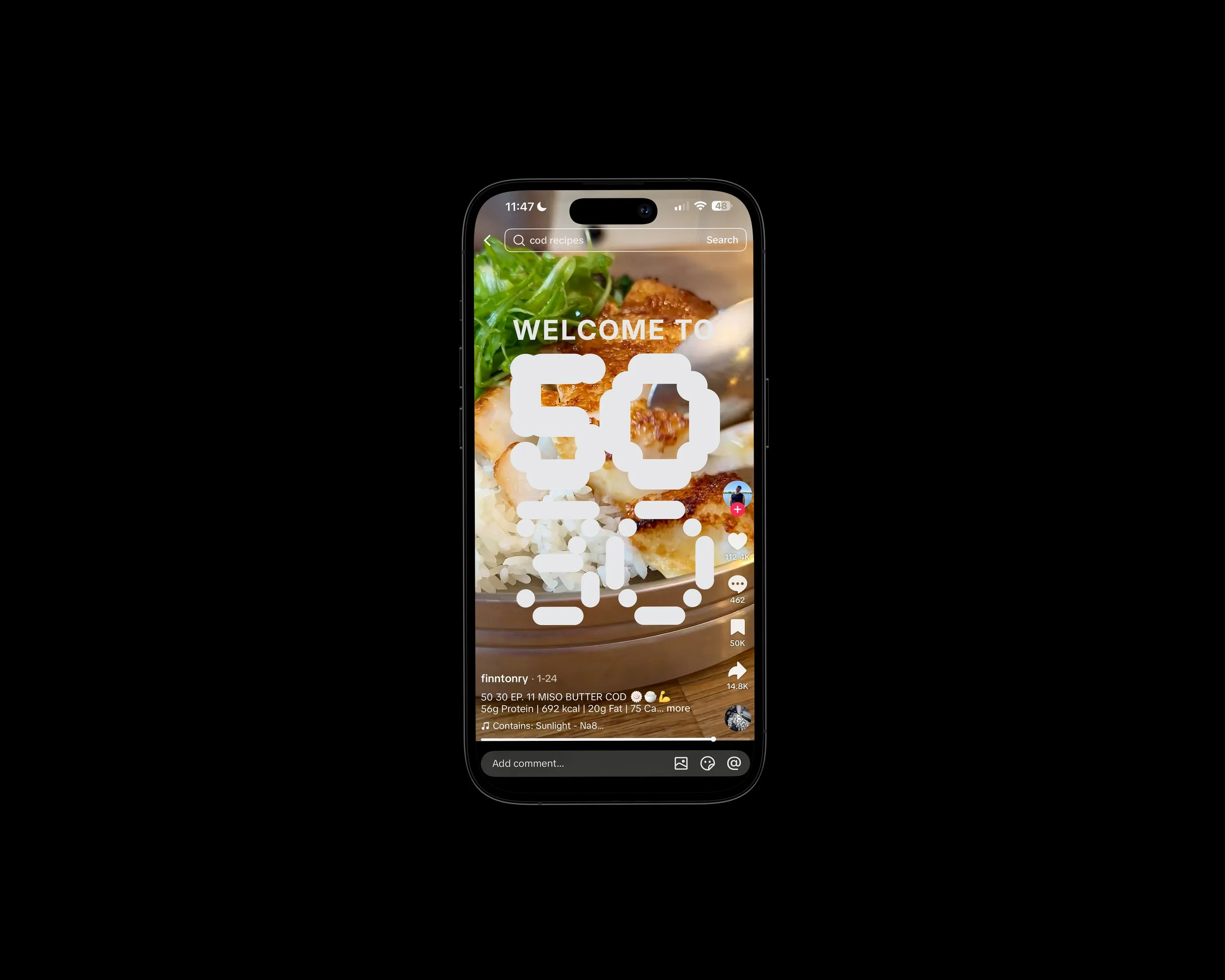
Publication design for Finn Tonry’s viral social media series ‘50 30’, focusing on high-protein, time-efficient meals.
Identity
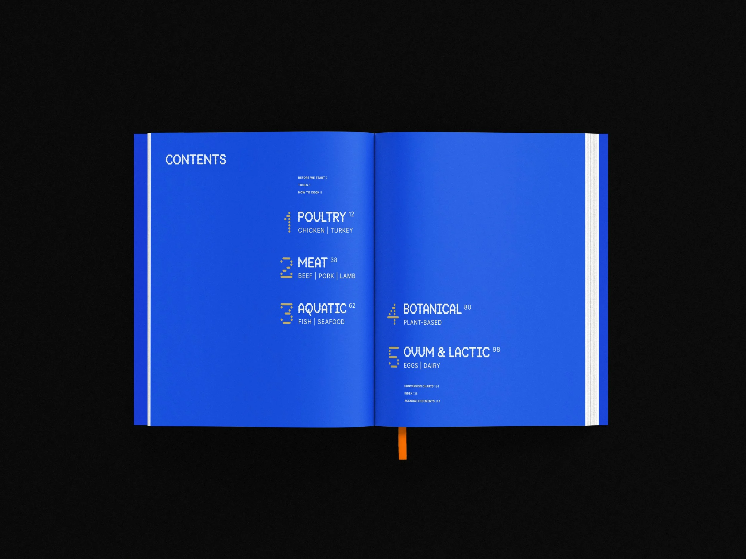
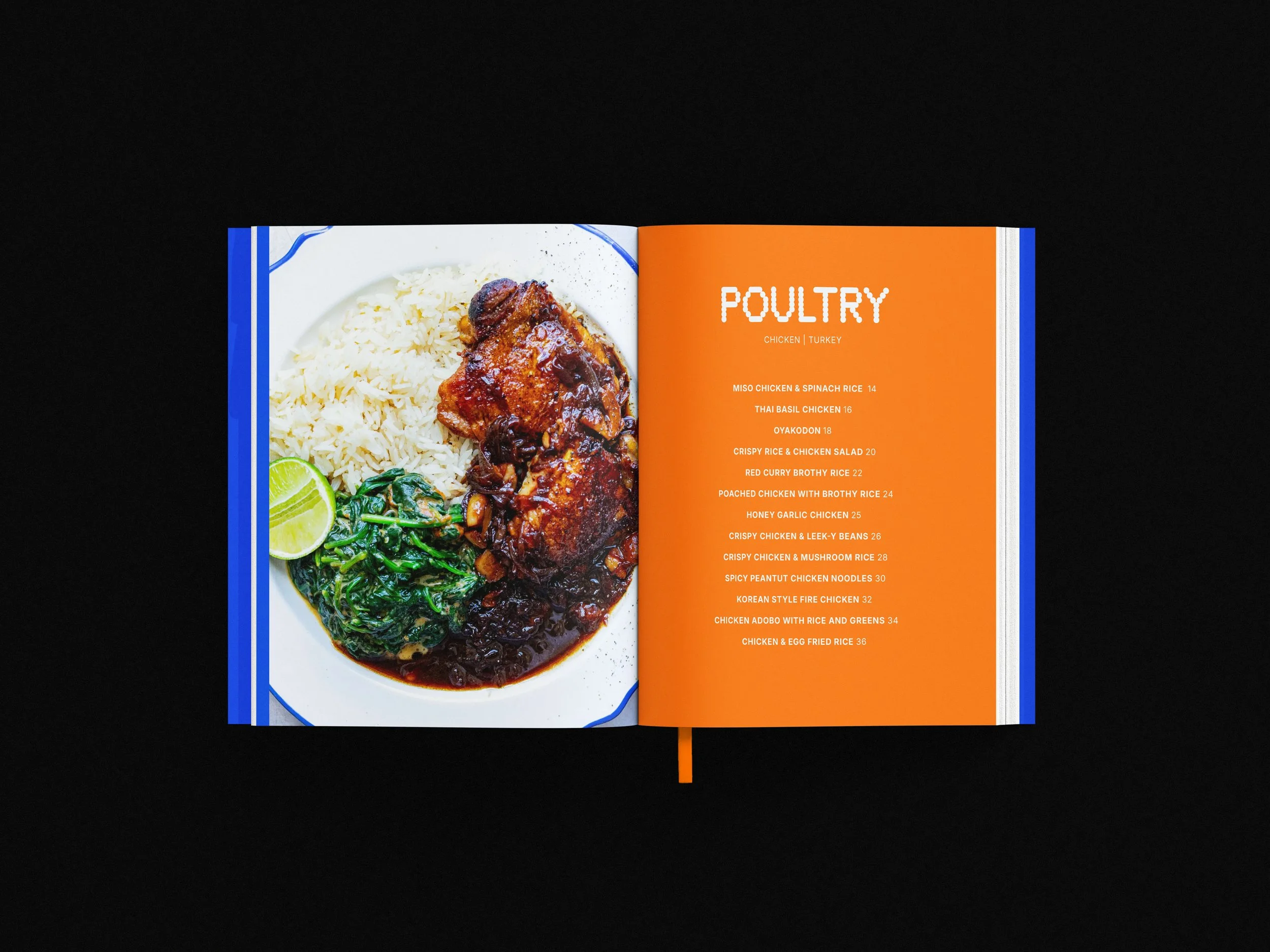
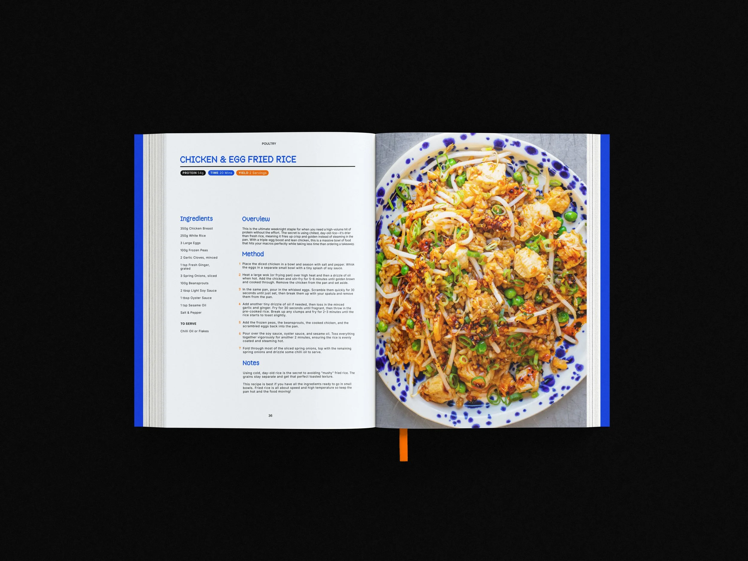
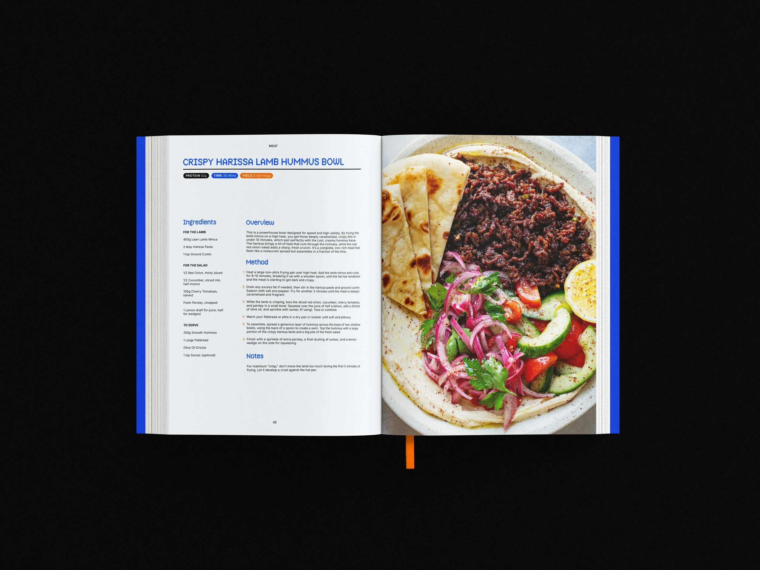
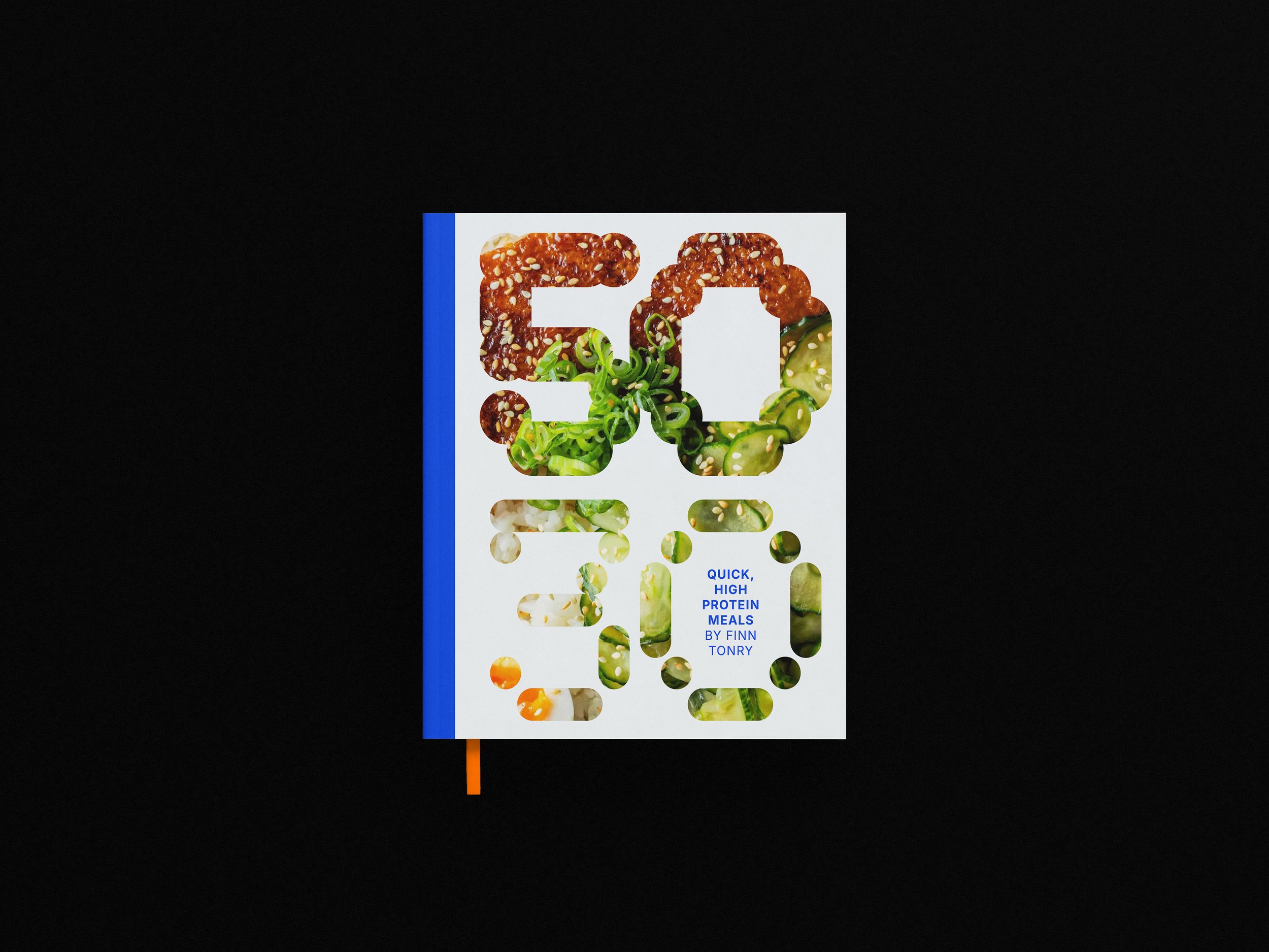
The design for 50 30 centres on the core principle of High-Efficiency Fuelling: maximising protein output (50g) while minimising time spent (30m). I translated that into a performance-led, almost scientific lens with a technical grid and monospace typography to prioritise speed and "at-a-glance" legibility (important for a cookbook).
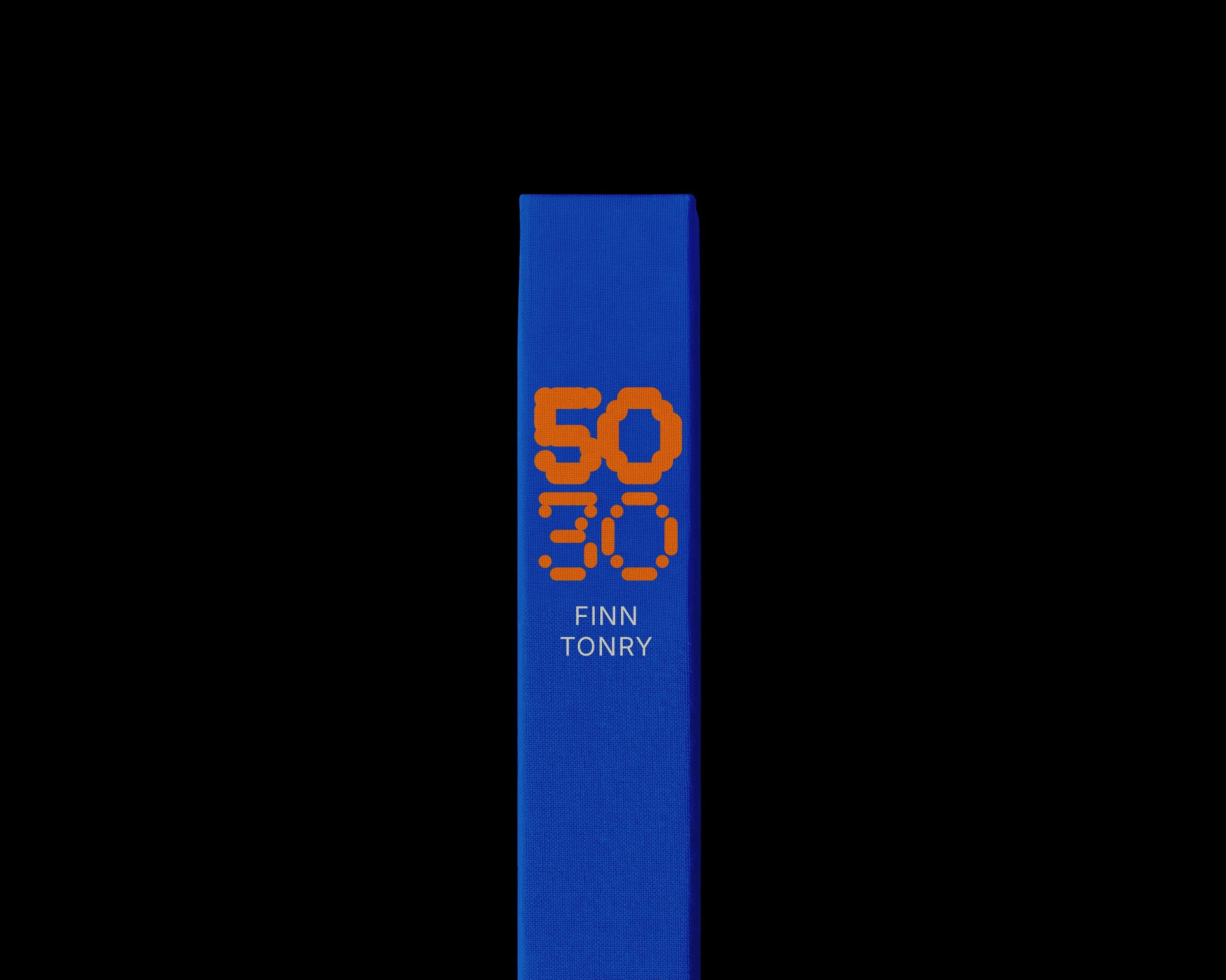
The custom typography on the cover symbolise the brand’s dual promise: the '50' is rendered with a heavy, muscular weight to represent physical mass via protein, while the '30' adopts a segmented, digital-clock aesthetic to show chronological precision and speed.