Wavy
Concept rebrand for Wavy - a premium curly haircare brand for men, leading to a job there!

Identity
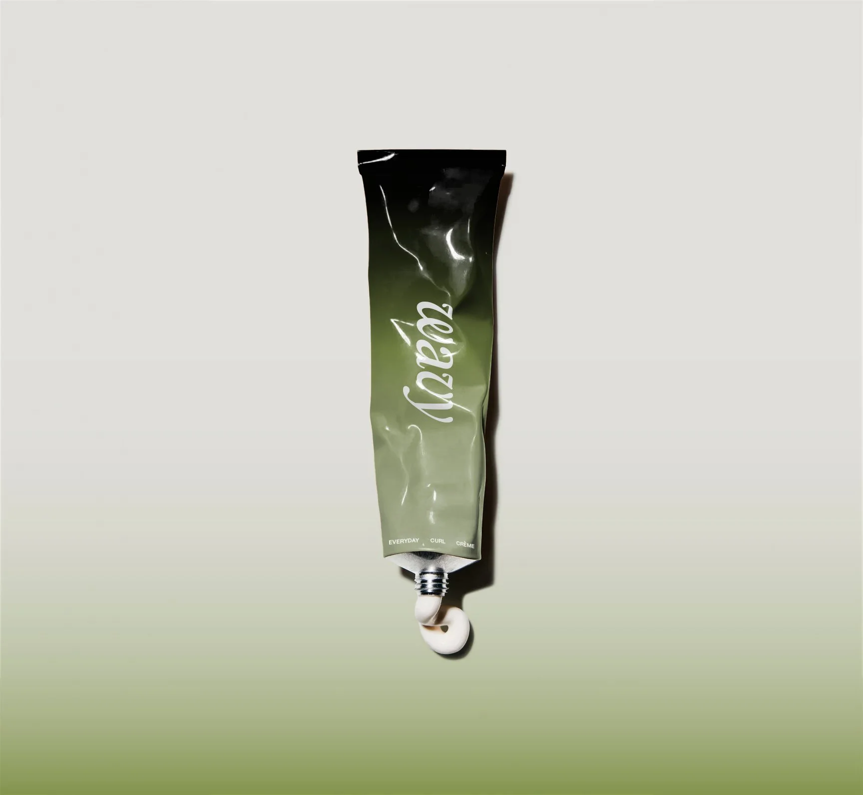
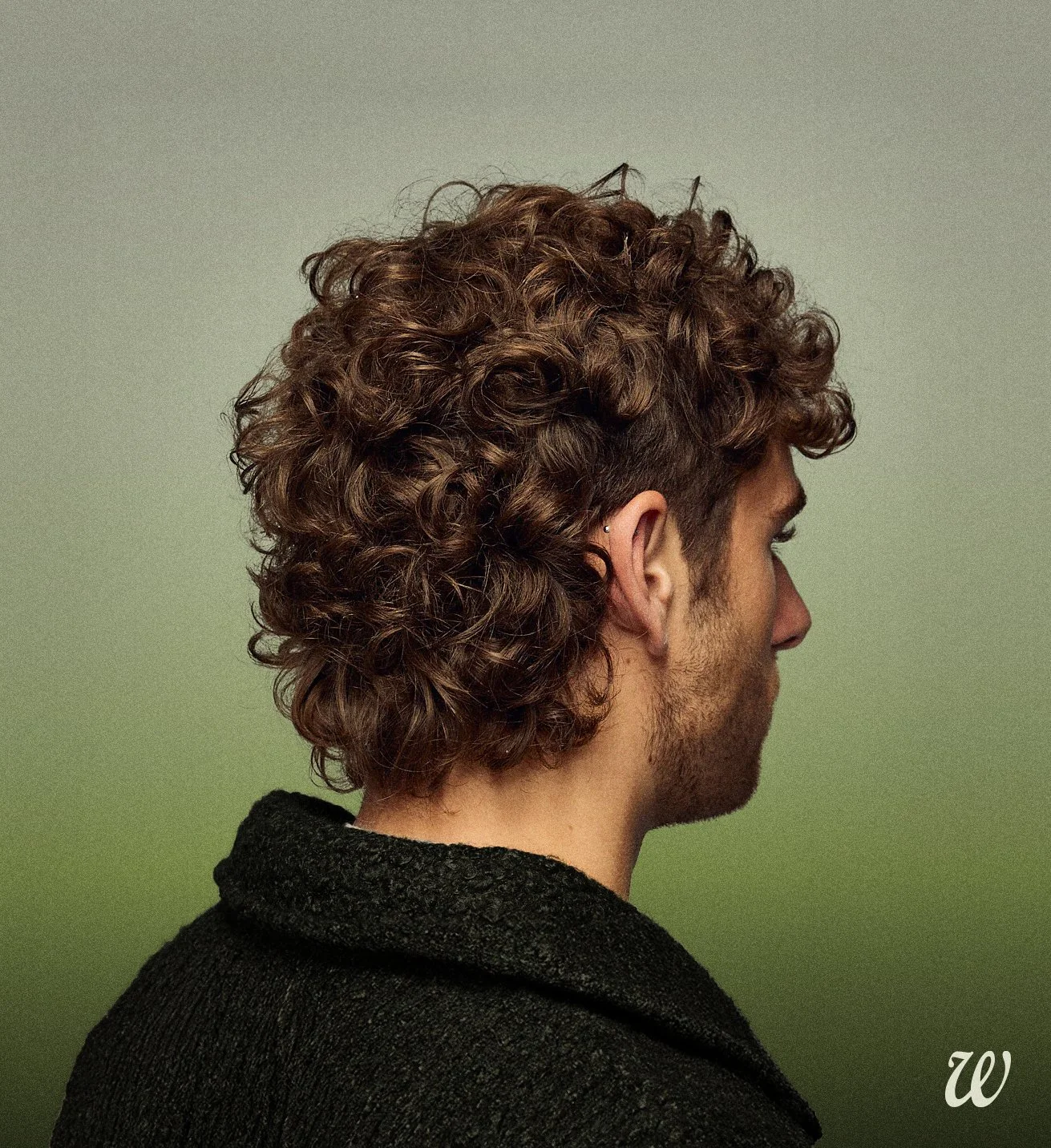
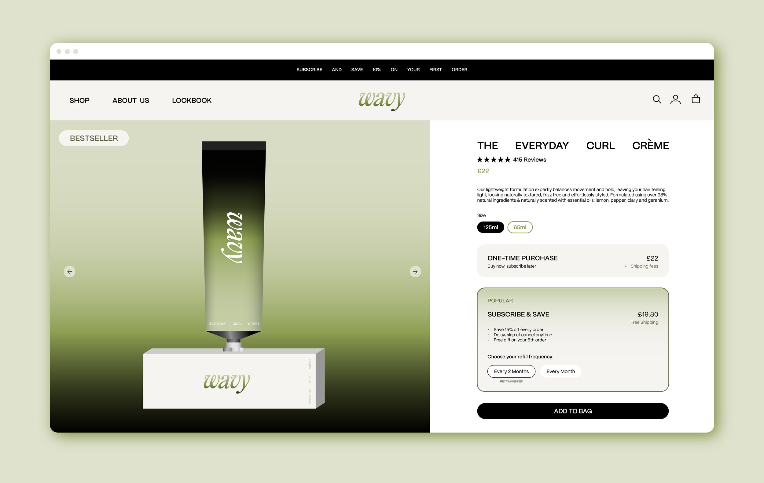
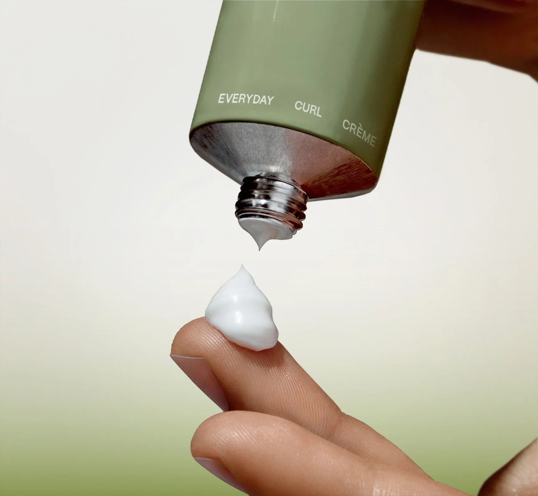
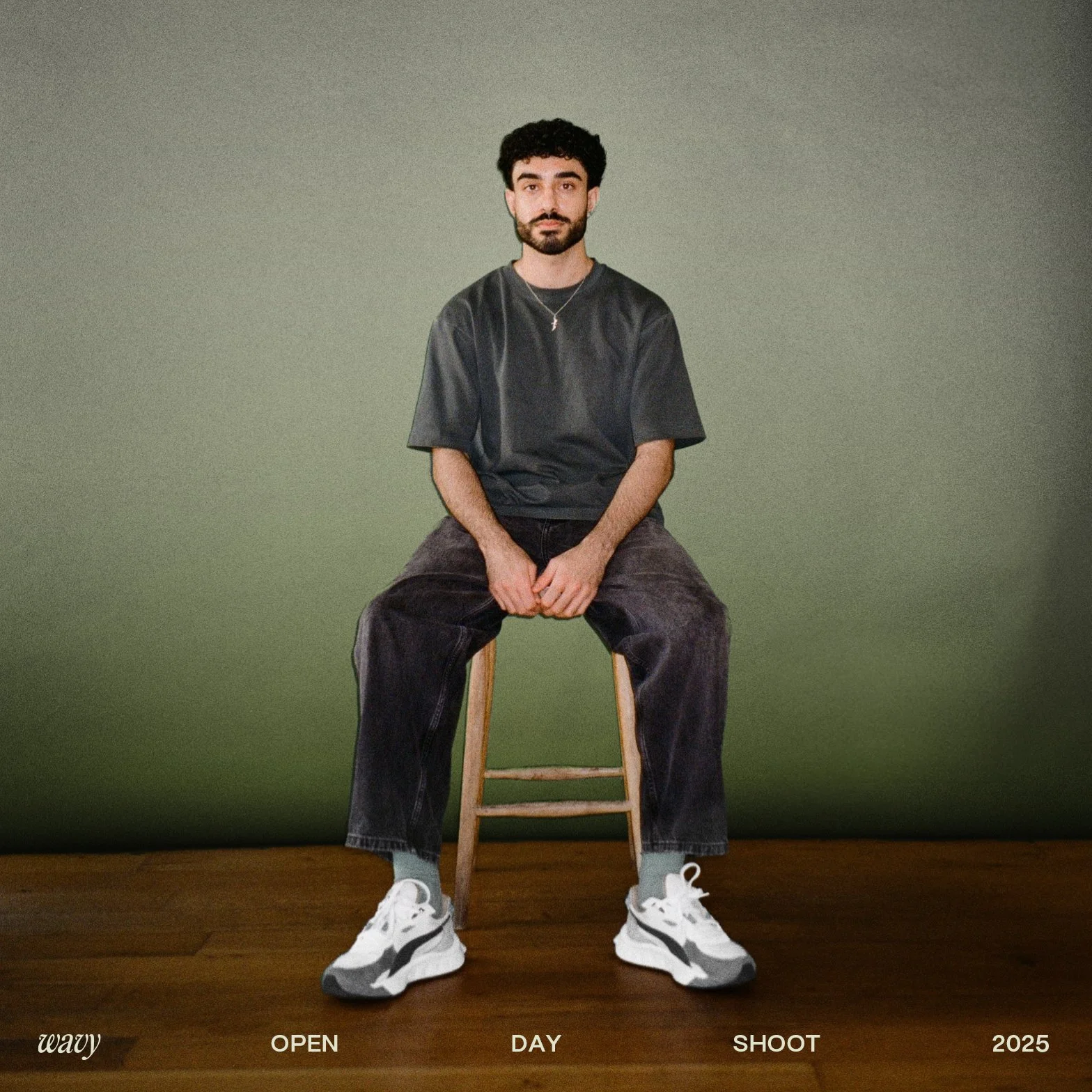
Soft green gradients give the brand a premium, polished feel - smooth and shiny like perfectly styled curls. The green grounds it in nature: iconic, earthy and instantly recognisable. Minimal layouts reflect Wavy’s simple, natural ingredients. Word spacing shifts from wide to tight, symbolising the transition from frizz to defined curls.

Logo
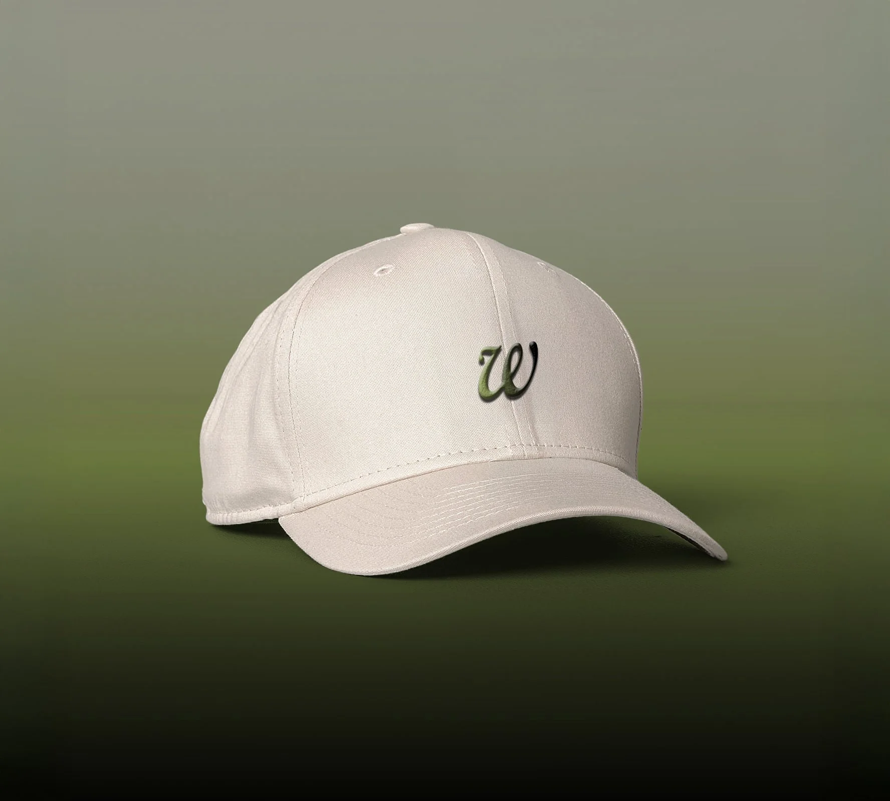
The logo is built from custom typography, designed to capture the natural flow and movement of curls. The ‘W’ especially takes the form of a single curl - when sideways on packaging and when alone on merch. It serves as a quiet nod to Wavy’s celebration of natural hair texture.

Comb Design
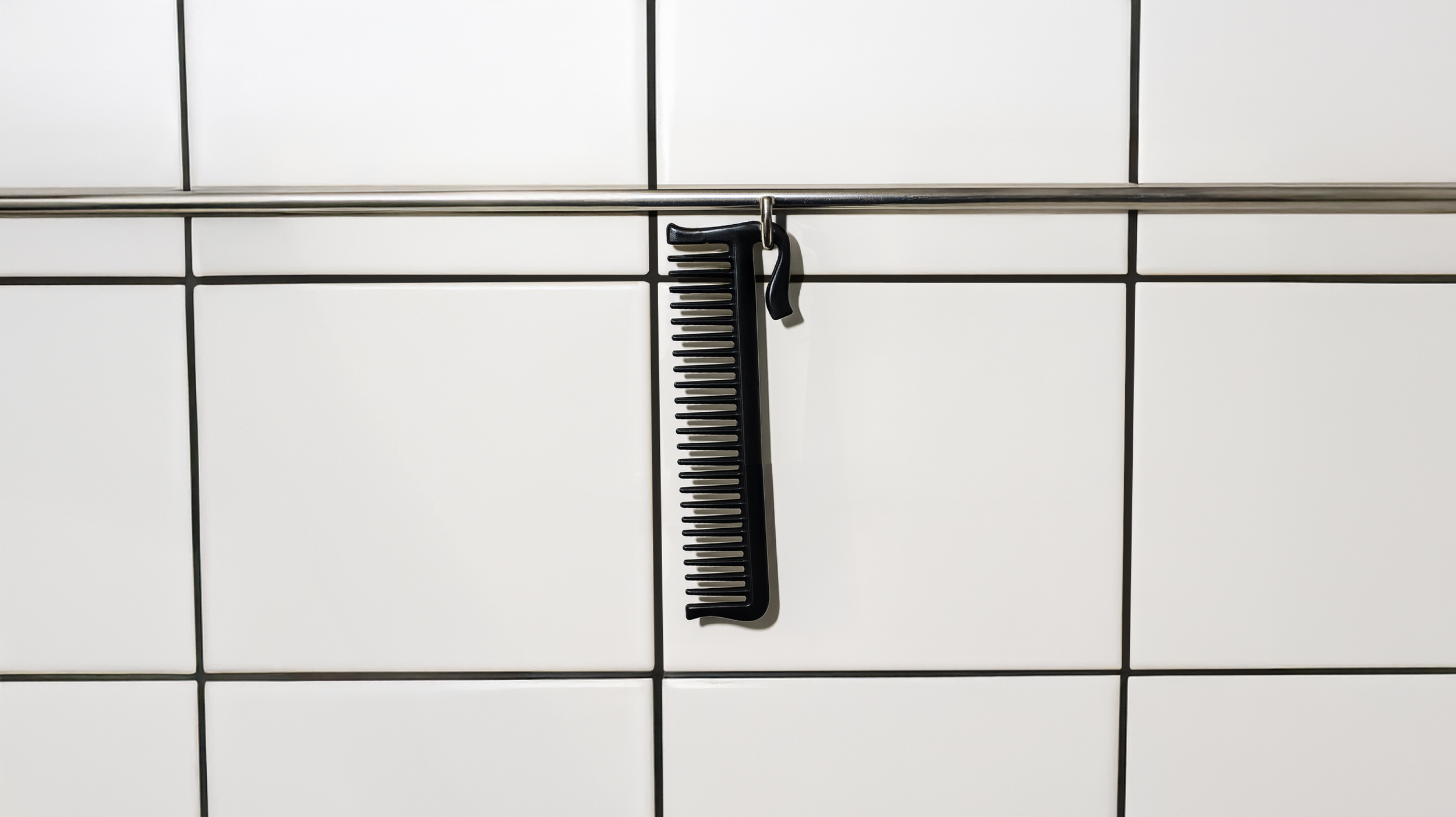
After sending this concept rebrand to the team at Wavy, they mentioned on a zoom call that they were in the process of designing a comb. I sent them this, a play on their logo (at the time) providing the comb with the much needed personality it was currently lacking - and a hook for hanging!